
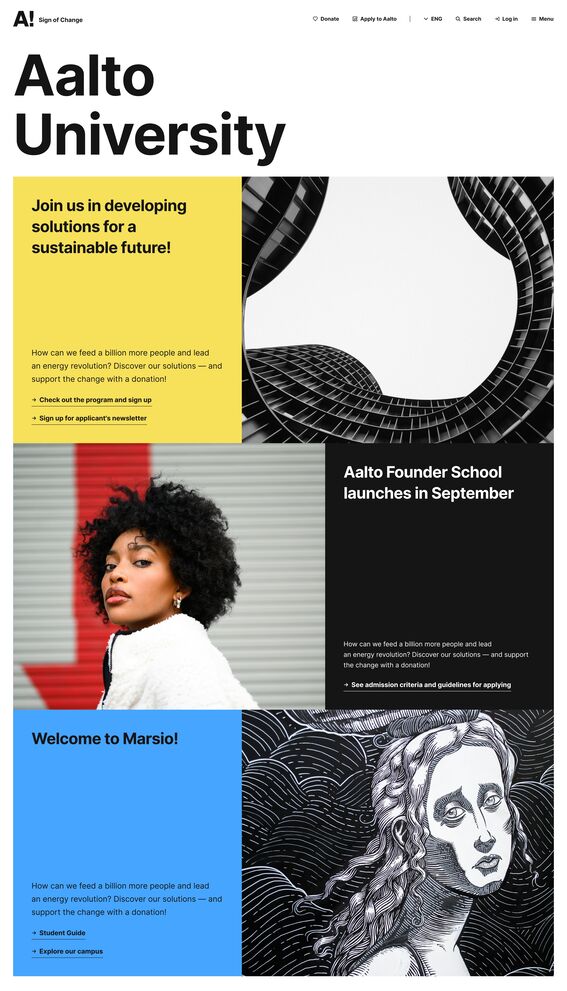
Hero components for hub pages
Hero component options (-> until Feb 2026)
These are the hero component options for hubs that will be updated in the spring 2026. See below for examples and instructions for the new versions.

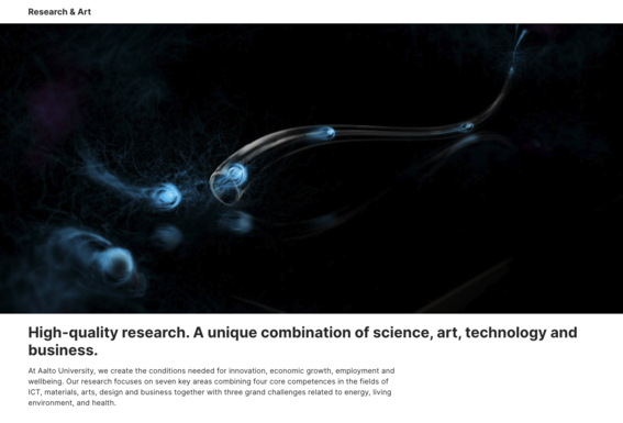
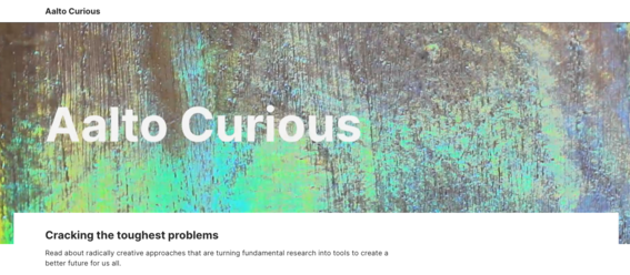
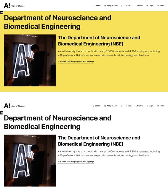
Hero magazine (live in spring 2026)
Hero magazine features a large image and space for heading, text and links. As the name "magazine" suggests, it gives an editorial feeling to the page if more than one magazine item is used. The image alignment differs from right to left automatically and you can now select the background colour for each item individually.
See examples of different Hero magazine variations in the images below.
Instructions
You can either use only one Hero magazine item, or create up to 3 items. Be mindful about the image and colour choices so that they match together.
When you want to create a new Hero magazine component or edit an existing one, use the following fields and functionalities to create the desired combination. Each field is created for individual Hero magazine item:
- Title: Write a title for individual item
- Summary: Write a summary that will show below the title, max 140 characters
- Image: Select an image for the magazine item. Image with the most important content in the middle is best. Please see the image below for guidance how the image will be cropped in different viewports (desktop, tablet and mobile).
- Link URL and link text: You can add up to 4 links. They can be either internal links that you will find by typing the name of the page you want to link to, or you can paste a URL to an external site.
- Theme: Select the background colour for the individual item. By default the hero magazine items inherit the Hub Branding colour selected on the very top of the editing form.
- Adjusting the order of the items within the component: Once multiple items have been added, the order can be edited by dragging the items to the desired order. The alignment of text and image (left or right) is determined automatically based on the order of items.

Image ratios in Hero magazine
Use an image where the main content is in the middle of the picture. Note that on desktop the image is shown in a ratio 5:4, on mobile the image is cropped from top and bottom. On tablet sized screens the image is adaptive, and depending on the amount of text it might be cropped to a much more vertical aspect ratio.
We discourage using any text or dates in images, but rather include them in titles and text.
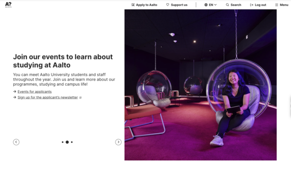
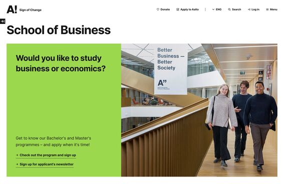
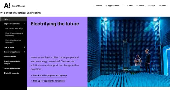
Hub description
This component has two options, medium and large, which refer to the image sizes. Compared to earlier versions, the new visuals will use all the same fields as they used to.
Medium
This is the most used hub hero component. This version features a square image and inherits the background colour from the hub Branding.
Large
This version feature an almost full width image with background colour from the hub Branding field.
Instructions and examples

The component itself only has the selection for the version: medium or large. The other fields are filled in the Basic information.
Hub name: The name will show highest on the page. The name is the most important content for search engines.
Slogan: Slogan used to be the heading for a hub, i.e. the title shown highest on the page. However the role is now to supplement the Hub name and add context. Slogan is not mandatory and can be left empty.
Main image: The image will show on the page and on the liftups, when the hub page is linked elsewhere on aalto.fi.
Description: This is the text chapter that will show below the slogan on both versions of this component. You can add links using the Link highlight style to reach the same visual style as in the examples.
Note that lead text is not shown on the hub page.
Hero text with links
This is the visually most simple hero component version that has no image. The background colour of the component is inherited from the hub's Branding field. You can add up to 4 links to the right column to complement the Title and Listing description. Links can have a heading or it can be left out.

Instructions
Hub name: Hub name will show above the background colour area, and is added on the Basic information of the hub editing page.
Title: This is added on the component. In the example picture above the phrase "World-class research with high impact" is the Title. Title is a mandatory field.
Listing description: This text will appear below the Title. Description text is also mandatory.
Links heading: In case you want to add more context for the links, you can add a heading. In the example picture, the text "Research with high impact" is this heading. Heading is optional and can be left out.
Per link item (max 4)
URL: URL address or an internal link can be added here. You can start typing the name of a page you want to link to.
Link text: This text will show for site visitors. If you add a link, it's mandatory to write the link text. It can simply be the name of the page you're linking to.
Hero video
Instructions will be added shortly
Brand colours in components
Add brand colours, including school colours, in the page header and selected components. The branding selection has been expanded with the main brand colours, too.

More Drupal instructions
Components: how to create content for aalto.fi?
Get to know the aalto.fi components for creating versatility and visuality when delivering your content.
Liftup components
Here, you will find a short description of and a link to the different liftup components available to you at aalto.fi. With them, you can visualise and highlight the versatile content on the site.
Text components for aalto.fi
There are a few different ways to display actual text at aalto.fi. Learn the difference between a quote and a highlight.